• About
  • Projects
  • Articles
  • Contact

julielivingstone

~ It isn't always about getting what you want. Sometimes it's about wanting what you've got.

julielivingstone

Monthly Archives: April 2012

Progress report, and Australian women artists of early 20th century

24 Tuesday Apr 2012

Posted by julielivingstone in Uncategorized

≈ Leave a comment

Tags

drawing, Grace Cossington-Smith, Margaret Preston, Thea Proctor

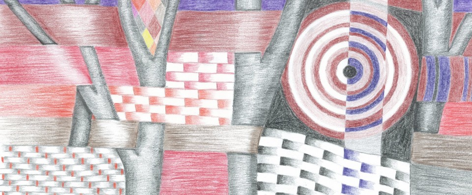
Now that I have the scrapbook, and decided on the format of the pages, I can start on the final drawings. There will be about 8 subject title pages, each of which will have a border, similar to these. I am drawing them by hand, within a grid, and colouring with watercolour pencils. It’s fairly slow work, I have so far finished one, and half done two more. Actually I haven’t finished, I have only drawn and coloured. My plan now is to scan the drawing, and print it out, it will be quite a bit smaller in the final version. Having seen how it looks, I will probably go over the watercolour pencil with water to bring out the colours, then over that with a fine black pen to divide up the colours, and give it the look slightly of leadlighting. I want to scan the drawing before I do that, in case it doesn’t look good. I might also go over one of the prints with the black pen, in case I decide to do just that step and miss out the water.
I’ve also started on the drawings for the subject pages. Each will have a pencil and probably coloured drawing of the subject, for example the ‘House and Home’ page has a drawing of a house, the ‘Recipe’ page has a still life of mixing bowl, jug, flour cannister etc. I took a photo of a vase of flowers to use for the ‘Garden’ page. I’m still keen on the Margaret Preston look for the drawings, although the look I am after is actually paintings rather than drawings, so I’m not sure how that is going to work. Co-incidentally a few days ago the Google doodle was about Grace Cossington-Smith, a contemporary of Preston’s, and also of Thea Proctor. The National Gallery of Victoria has quite a few works by all three artists, just go to  www.ngv.vic.gov.au, on the Explore tab, you can browse artists by name. I looked under C for Cossington Smith, but found her under S for Smith. She is less well represented than the others.
I have a feelling it would be possible to spend hours on that site, it’s a good substitute for going to the gallery, given that the gallery is several hours away even by plane, and even if I went I suppose not all the pictures would be on display at any given time.
I need to firm up on the other subjects, and decide on suitable drawings.
I also bought some calligraphy pens, not actual fountain pens, but fibre tip type pens with chisel points. I shall use them to write the quotations, and possibly some other stuff. I do have a calligraphy set somewhere, but currently I can’t find it so these are a good substitute. Will set aside some time for a little practice before I start for real.
Planning to get up early tomorrow morning and go to the dawn service for ANZAC day. Not the main one in the city, too much hassle to get there, and find somewhere to park, so I’ll stick with a smaller suburban one. I’ve never been before, but often thought I ought to give it a go. Material for a blog post tomorrow, and for 750 words.

Advertisement

Share this:

  • Twitter
  • Facebook
  • Email

Like this:

Like Loading...

Exciting Source for Embroidery Designs

17 Tuesday Apr 2012

Posted by julielivingstone in Uncategorized

≈ Leave a comment

Tags

Art Deco, design, drawing, embroidery

I found a wonderful source of antique embroidery patterns and books on the net, all scanned and available under a creative commons licence. It’s here. There is heaps of stuff there, and it would take an age to look through it all, but by dint of looking at published dates I was able fairly quickly to come up with two or three possibilities for the cover of my commonplace book. Yesterday I went shopping and spent ages looking at possibilities for the book itself, and finally bought one. It’s a scrapbook, only a small one at 8 inches square. The bigger ones are 12 inches square, and I debated long and hard, but the big one is too llimiting in terms of paper and printing. You’d need to use A3 paper and cut it down, and there just isn’t the variety that you can get in A4. With a smaller book I’ll have many more options for printing on coloured paper, it will be easier to scan and print my drawings to a suitable size, and altogether I think better.
I’m going to do a cross stitch design for the front cover, there are at least two if not three possible designs on the site which I have downloaded. A couple are only in black and white, one of which is a bunch of flowers which would be quite easy to colour, the other is a pair of peacocks, which I can see in just black and white, or possibly red and white. Any colour and white I guess, except that black and red are traditional, although not necessarily very art deco. Then there is a very geometric design in a few colours, an oval shape, but I could find a border to put round it. At the moment I am leaning towards the bunch of flowers, if for no other reason than it has a slightly wood cut look to it, and I’m also trying to get a Margaret Preston feel in some of the other drawings.
Now that I have the book I have no excuse not to push ahead with the drawings, before I run out of time. I think I’ll start with the title page, if I’m going to put embroidery on the front cover then the design I had for the cover can go on the title page instead. That’s the logo made up of the letters of ‘book’, and the word commonplace drawn in a suitable font. Do I stick with a certain palette of colours throughout the book? I think it would be better to do so, in which case I might need to stick to one medium for the drawings. I can probably do acrylic, need to buy some more white if so since I have none, and that limits mixing of colours and tints. I’m leaning towards a purple/plum/pink palette, with some greens as well, and purplish browns. Perhaps also some peachy colour, although not orange. More an ecru, no, darker. Not sure what it is called, don’t even really have it in my mind yet. I guess all this deliberation is part of the concept development, and must be documented somewhere for assessment. I should also try out the water colour pencils, but I don’t think they will give the look I am after. I need to experiment a bit with mixing colours for them.
Here are the embroidery designs I am considering, all downloaded from the site above. What a wonderful resource it is. It would be terrific if there were a similar resource for sewing and dressmaking patterns, but I don’t know of one.

oval design    bunch of flowers   peacocks

I thought uploading the files would make the picture appear in the post instead of a hyperlink. It usually does, but these files are pdfs which seems to make a difference. Not sure why.

Share this:

  • Twitter
  • Facebook
  • Email

Like this:

Like Loading...

Mid-semester review – the point at which I start re-thinking my design

04 Wednesday Apr 2012

Posted by julielivingstone in Uncategorized

≈ Leave a comment

Tags

Art Deco, design, drawing, embroidery, Margaret Preston, time management, writing

Mid semester review went OK at TAFE yesterday. Most of the other students have drawings, but not much idea of how they are going to fit a story, or put the book together when it’s done. I, on the other hand, have a very good idea of what I want it to look like, I just have to make it happen. Although, I am now wavering a bit on the style of the thing. For each of the subject title pages I was going to do a drawing, pencil with maybe a watercolour wash. Now I’m leaning more towards a woodcut Margaret Preston type of thing, like these but I’m not sure I can do it. I wasn’t going to do a woodcut as such anyway, but a drawing in that style, but they are very simplified, and I think that takes more ability than I currently have. I really want to have that Art Deco look though, which a pencil and watercolour drawing doesn’t necessarily have. I have two weeks, (mid-semester break apparently now only 2 weeks instead of 3, which means the whole thing is a week shorter) to work on getting the style right. I also have to figure out the cover, which was going to be fabric with a painted design. Peter said he’d like to see some needlework or textile work, and then when I went to the library I got a book out about painting and decorating textiles, so I’ve gone from having a clear idea to starting again. The design I have drawn is too small to applique, I could do canvas work or surface embroidery, which would be more authentic? Needs yet more research, I’m leaning towards canvas work. There is also the issue of wearability, I don’t want it to look tatty after only a short time, although in point of fact it’s not likely to get any wear at all. I’m also thinking again about the format, A4 does not leave much space for content, after allowing a bit down the side for the binding, perhaps I should go with the ready made scrapbook covers in Spotlight which are square. They had some with a cutout in the middle, I could always put a piece of embroidery in there, I think there was a clear plastic bit which would protect it.

This is a problem which I have had before when trying to be creative, getting to a point where I feel I have done the best I can, and then just trusting to that, instead of re-thinking numerous times. In this instance there is a time limitation, I have to leave myself enough time to actually do the work at the end. I have a feeling the critical point is coming soon.

Share this:

  • Twitter
  • Facebook
  • Email

Like this:

Like Loading...

750words – writing regularly

02 Monday Apr 2012

Posted by julielivingstone in Uncategorized

≈ Leave a comment

Tags

750words, blog, trees, words, writing

I’ve started writing on 750words.com, doing at least 750 words everyday, the idea being to get into the habit and accept the discipline of writing regularly. I’d like to think that at least once a week what I write there could just come straight here and be a blog post, but it may not be that easy. Anyway, here is today’s effort. (This isn’t 750 words, I wrote more which wasn’t relevant.)

The view out of the window – they always say write about what you know!
My office window looks out onto a major highway, the only one going from Western Australia across to the rest of the country. I have no idea how many vehicles go past every day, but it’s a big number. Everything from cars to buses to huge trucks. Sometimes, actually quite often, it’s people on bikes, and I cannot imagine what makes them want to ride on the highway. I would be petrified, apart from all the exhaust fumes they must breathe in. There are several back roads they could take through here instead, and even a walk/bike track which would surely be much more pleasant.
Even though it’s a major highway, there as still plenty of trees in view. Some in front of the office on this side, and on the other side of the road there are only trees to be seen. The houses are hidden behind them, well back from the road. The trees are almost all native, some indigenous to this part of Australia and some not. Actually some of the trees over the road are going quite yellow, so I’m not sure what they are. I don’t ever recall having seen deciduous trees over there before, but maybe there are. Otherwise it’s mostly eucalypts, and small acacias underneath them. There is quite a range of colours, from grey-green through mid to dark greens, the slightly yellow green of the trees I don’t know, to bright green grass on our side where the drains run out. The rest of the grass is dead and brown as it always is at this time of year. The tree trunks range from brown, to grey to cream, some a brownish almost pink colour. The sky at the moment is quite grey and overcast, as if it might rain, but it’s not very likely to by the look of it. Been waiting for it to rain since yesterday morning, but hardly enough yet to drown a flea, let alone lay the dust.
I’m trying to come up with descriptions of things which haven’t been used to death. For example, grass as green as ? Emeralds, been done. Actually thinking about it, green as grass is perhaps more usual. What else is bright green, and could be used as a description? What would everybody, everywhere, recognise as green? Astroturf? Still a variant of grass. Kermit? Better perhaps. Perhaps that one’s too hard.
The sky? Ash grey? I don’t think you hear that one too often. Dove grey, leaden is overdone. Sounds, continuous swoosh of traffic going past, broken by the occasional heavier note of a truck, or the roar of a speeding motorbike. Sometimes a siren, at which everybody looks up to see what type of vehicle, and during summer heaves a sigh of relief if it’s not a fire truck. Again, heaves a sigh of relief, breathes again, how could that be better described. A touch of guilt at feeling thankful that it’s only an ambulance, and somebody else’s problem. Fire has the potential to be devastating in this environment, but an ambulance can mean a devastating event in somebody’s llife.

Share this:

  • Twitter
  • Facebook
  • Email

Like this:

Like Loading...

Blogroll

  • Learn WordPress.com
  • Live to Write – Write to Live

Back Pages

  • July 2018 (1)
  • November 2017 (1)
  • August 2017 (1)
  • June 2017 (2)
  • March 2017 (1)
  • October 2016 (1)
  • September 2016 (1)
  • August 2016 (2)
  • March 2016 (2)
  • February 2016 (2)
  • January 2016 (3)
  • August 2015 (1)
  • March 2015 (2)
  • February 2015 (1)
  • January 2015 (3)
  • December 2014 (2)
  • November 2014 (4)
  • April 2014 (2)
  • November 2013 (2)
  • October 2013 (1)
  • July 2013 (1)
  • June 2013 (2)
  • March 2013 (1)
  • February 2013 (2)
  • January 2013 (2)
  • December 2012 (3)
  • November 2012 (3)
  • October 2012 (4)
  • September 2012 (4)
  • August 2012 (1)
  • July 2012 (1)
  • May 2012 (1)
  • April 2012 (4)
  • March 2012 (2)
  • February 2012 (3)
  • January 2012 (3)
  • December 2011 (3)
  • November 2011 (5)
  • October 2011 (4)
  • September 2011 (2)

My Tags

Anthony Trollope Art Deco article ASG asymmetrical ATASDA Australian Sewing Guild blog blogging book books challenge Christmas clothes clouds colour commonplace book competition content craft creativity design dogs drawing electric embroidery fabric fashion illustration fence freelance Fremantle garden horses ideas inspiration in every issue Jeeves Koos van den Akker labrador language learning machine embroidery magazine Margaret Preston Mozilla novels op-shop origin of phrases pattern PG Wodehouse photography phrases project property quilting reading reconstructed recycled Roald Dahl sayings ScribeFire seo sewing skirt Threads magazine transfer dyes Tris Hussey TS14Plus upcycled water weather Wooster Wordpress words workshop writing

Create a free website or blog at WordPress.com.

Privacy & Cookies: This site uses cookies. By continuing to use this website, you agree to their use.
To find out more, including how to control cookies, see here: Cookie Policy
  • Follow Following
    • julielivingstone
    • Join 36 other followers
    • Already have a WordPress.com account? Log in now.
    • julielivingstone
    • Customize
    • Follow Following
    • Sign up
    • Log in
    • Report this content
    • View site in Reader
    • Manage subscriptions
    • Collapse this bar
%d bloggers like this: