Tags
I’ve never really understood what an artist’s sketchbook was, other than the obvious concept of a book in which somebody made a rough sketch of a church, landscape etc., took it back to the studio and transformed it into a finished artwork. Apparently it can also be a place for an artist to develop ideas, create designs, play with possibilities. And you don’t have to be an artist in the sense of somebody who paints or draws pictures. Artist is a broad term, someone who creates in whatever medium.
Now though, I have a better understanding. I took an online workshop entitled Developing Sketchbooks, by Dionne Swift. And I have a sketchbook!
OK, so it’s not that great yet. But I did gain a lot of tools for developing ideas, even for coming up with ideas in the first place. My difficulty when I want to create designs for embroidery, embellishment etc., is coming up with an idea. I can’t draw well enough to use realistic images, flowers etc. But I struggle to find abstract ideas. Dionne gives you lots of ways to come up with those ideas, and develop them into usable designs.
Here are one or two of my sketchbook pages, some I am happy with and some need more work. But I have made a start!

Sketchbook pages

Single page

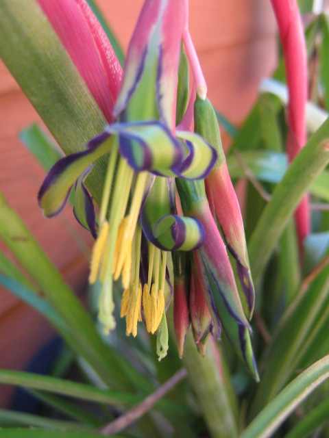
continuous line drawings
One of the exercises was to do continuous line drawings of a subject, both whilst looking at the subject as well as the drawing, but also without looking at the drawing. This leads to some really weird looking objects! But it can also be a starting point for some interesting shapes to develop further. Dionne’s comment that a drawing doesn’t necessarily have to look like the subject was very liberating!
Our neighbourhood ASG group is doing a workshop next month on heat transfer dying, and I’m going to spend some of the time between now and then working on my own design to use. Watch this space!