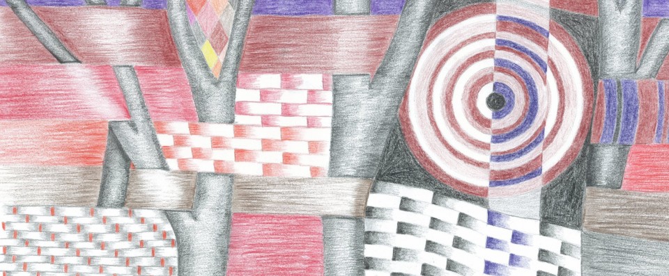
In class at TAFE we talked about the principles of design, and I’ve also been doing some research. I came across this site here, which has a good but simple explanation of the principles. The first thing it talks about is composition, but I actually think that encompasses most of the other principles, it’s the way you put those principles together. After that come balance, proportion, repetition, dominance, harmony, contrast, unity and variety. All of these can be applied to colour, shapes and textures, for example you can have contrasting colours, or harmonic colours such as a monochrome composition. A single colour might be dominant, or repeated throughout the design.
I find it a little bizarre that these principles are touted everywhere as ‘good design’, and yet examples of ‘good design’ are often wildly different. Sometimes it’s hard to see where the principles have been applied. I’ve also been doing a lot of research on Art Deco, and designs in that genre vary widely. There are brightly coloured, highly intricate designs, such as these glorious examples by Gunta Stolzl, and there are very subdued and simple patterns like these by Donald Deskey. I think you probably have to spend a good deal more time than I have to isolate the design principles in some of them, and then it’s sometimes difficult to decide why one is ‘good’ design and another not. But then, I’ve often thought that about art in general. The ultimate ‘challenge’ I guess is a square canvas painted with one single colour, perfectly flat, and figuring out how that comes to be a piece of art. Or what is the skill involved. A cynical person would say that the skill lies simply in selling the artwork to somebody.
Still, the real beauty surely lies in the fact that everybody has their own ideas, can like different things and enjoy them.

